email marketing campaign strategy
E-commerce has become a cutthroat industry.
With everyone and their brother-in-law setting up e-commerce businesses and the competition is super stiff.
That’s why you must do everything in your power to position yourself for more sales.
One way to do that is to optimize your Buy Now buttons.
What is a Buy Now Button, and Why is Optimization Important?
Cart abandonment costs businesses $4.6 trillion globally. Research shows that two of the top reasons shoppers abandon carts are:
- 28% say it’s because of being forced to create an account
- 21% say it’s due to a long (or complicated) checkout process
Optimized buy now buttons can help streamline this process for users by kicking off a simpler checkout process. In its simplest form, a Buy Now button is a link or actual CTA button that, once clicked on, takes shoppers directly to a:
- Product page: this works best if you’re promoting a new product and want prospects to see some social proof before buying.
- Cart: Looking to increase your average order value (AOV)? Then link your Buy Now button to the shopping cart and encourage buyers to meet the deal or shipping threshold you’ve set.
- Checkout page: This works best for products you’re promoting with urgency/scarcity, like a flash sale.
The advantages of Buy Now buttons are that they reduce cart abandonment rates and increase sales.
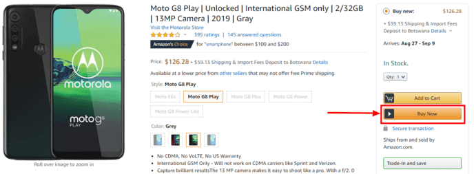
Here’s a typical example from the e-commerce giant, Amazon:
4 Ways to The Buy Now Button for E-Commerce Can Help Increase Your Revenue
Let me show you four simple, yet powerful reasons why Buy Now buttons can make a huge difference in your bottom line:
Generate Demand
Demand generation is an important aspect of increasing online sales. A well-optimized Buy Now button is a great way to generate demand across multiple online platforms.
Speed Up the Checkout Process
Buy Now buttons bypass most steps and protocols shoppers have to go through to make a purchase, thereby helping customers make purchases faster.
Skip Account Creation
Not everyone who buys from your store wants to create an account. A Buy Now button makes it easy for shoppers to purchase products on your store as guests from any platform they see your product on.
Improve User Experience (UX)
With a Buy Now button, you can sell to your customers from any website or platform (like social media) that supports the Buy Now button function. This drastically improves your UX, as customers can make a purchase on the same site in seconds.
Buy Now buttons make life easier for both you and your customers.
Where Can You Use Buy Now Buttons?
One of the biggest advantages of Buy Now buttons for e-commerce is that they help maximize the ROI of omnichannel marketing.
With so many platforms and channels, it can be quite tricky for e-commerce businesses to drive sales. When trying to lead prospects down your sales funnel, the main cause of friction is the number of touchpoints needed to take them from a piece of content to your shopping cart.
Which is where Buy Now buttons can save the day.
By placing buttons on platforms your target audience frequents, you can encourage them to buy right from that very platform. Wondering where you can use a Buy Now button for e-commerce success? Here are some of the most effective locations:
Use Buy Now Buttons on Blog Posts
Studies show that 87% of people research a product online before making a decision to buy. One way they research is by reading blog posts. These can be blog-styled product reviews or other pieces of content that feature or mention said product.
For e-commerce stores, bridging the divide between the content experience and the purchasing experience can be a struggle. Few have managed to design an experience that results in interested shoppers actually checking out. (If you do need help with this, feel free to reach out on my digital marketing consulting page.)
Buy Now buttons eliminate the long transition from content to checkout.
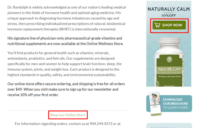
By clicking on the button right there in the content, readers are taken straight to the product page where they can make their purchase.
Boost Your Email Marketing ROI with Buy Now Buttons
Email marketing is important for generating sales for your business. It gives an average ROI of $44 for every dollar spent.
That’s why you must incorporate a Buy Now button in your email campaigns. It bolsters an already solid marketing strategy.
Here’s a good example from Etsy. It alerts the user that an item they’ve already added to their shopping cart is now on sale, giving them a great incentive to complete the sales process:
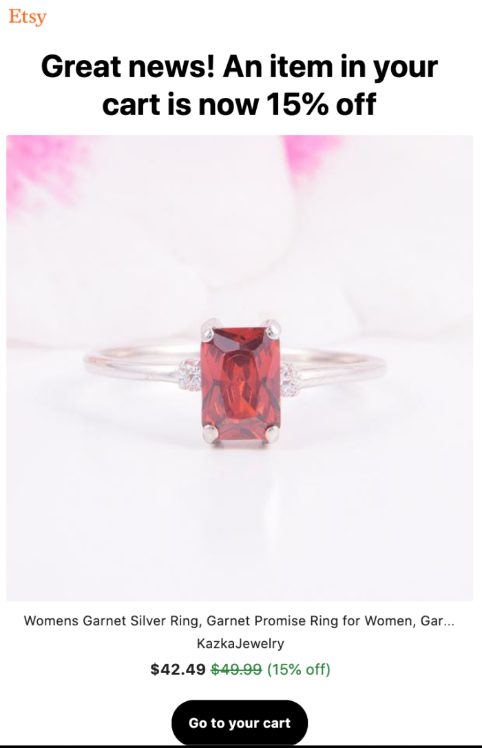
This helps provide a great UX by streamlining the email to checkout experience.
Win the Affiliate Marketing War with Buy Now Buttons
Affiliate marketing is all the rage right now because setting up an affiliate site is super easy.
Doing it effectively, however, is another thing altogether.
That’s why you need to leverage the power of the Buy Now button and add it to your affiliate links. The visual appeal of a Buy Now button is more compelling than a normal link and is bound to drive your conversions up.
Fire Up Your Retargeting with Buy Now Buttons
Statistics say the average conversion rate on websites is about 2%. That means 98% of the people that visit your website never take action.
This is where retargeting comes to play.
Using cookies, you can “follow” them around the web showcasing your products – particularly the one they expressed interest in.
Enter the Buy Now button.
A well-designed retargeting campaign with an equally well-optimized Buy Now button is a potent solution to winning back bounced visitors and turning them into paying customers.
How to Optimize Your E-commerce Buy Now Button for Explosive Conversions: 3 Easy Tips
To understand how best to optimize your Buy Now button, you must first understand the psychology behind it. Here’s a brief explanation of how to ensure your button will convert like gangbusters:
Purple Cows Drive Sales
First coined by Seth Godin, a purple cow is hard to miss.
That’s exactly what your Buy Now button needs to be. To achieve this, your Buy Now button must be designed to look like a totally different element from the rest of your site. Two ways to do this are making your Buy Now button big and using a contrasting color.
For your Buy Now button to be a purple cow, it must look like it doesn’t belong.
This design strategy will help you achieve two things:
- Visual impact: By being different, your Buy Now button will immediately attract attention.
- Rouse curiosity: Human beings are curious by nature. Anything different rouses curiosity and compels users to investigate more.
.These two steps will ensure users take a closer look at your offer — and hopefully increase your sales.
Use Color Psychology to Trigger an Emotional Response
Research has proven what many people have denied for a long time: people’s purchase decisions are based more on emotion than logic.
One of the best ways to trigger emotional responses is by employing color psychology.
Color is a great way to make people feel what you want them to feel, and more importantly, take the action you want them to take. So which colors work best with Buy Now buttons?
Here are a few examples:
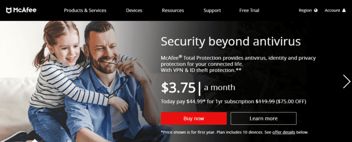
Red
Red invokes excitement and urgency. These are emotions that encourage shoppers to take action quickly. The feeling of excitement also helps buyers get excited about their purchase, thereby encouraging them to click your Buy Now button.
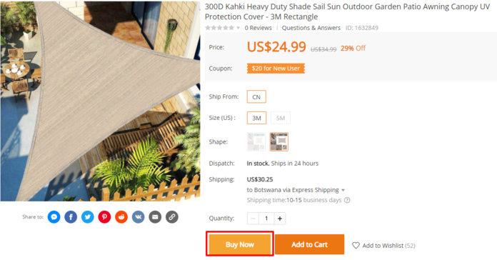
Orange
This color inspires feelings of confidence, warmth, activity, and friendliness. It’s best suited for Buy Now buttons selling outdoor products and other products associated with excitement, vitality, and fun.
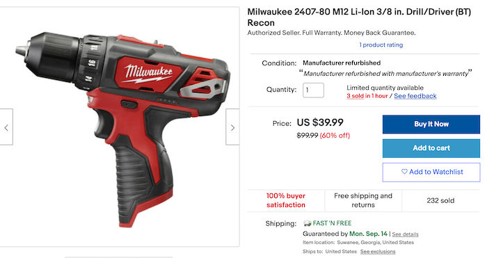
Green
Green is often associated with tranquility, nature, power, and health. Selling supplements and other health products or farming accessories? A green Buy Now button could help you drive sales by helping you form an emotional connection with your target audience.

Blue
Associated with tranquility, water, reliability, and peace, the color blue works best for brands that want to evoke feelings of security, reliability, and stability, just like the logos of Ford, Samsung, and PayPal.
Placement Can Help You Bank More
The placement of Buy Now buttons for e-commerce can be tricky. That’s particularly true on platforms you have no control over.
However, on your web pages, find a place users can’t miss and place your Buy Now button there. A few places to consider include:
- Immediately below your product’s featured image
- Above the fold, if it’s on a website, landing page, or email.
The key with placement is to ensure your Buy Now button occupies a prominent position.
Tracking and Analytics For E-Commerce Buy Now Buttons
Tracking the performance of your Buy Now buttons is not straightforward. That’s because you’ll have to track it across multiple domains and channels.
One of the best solutions to tracking your Buy Now button across multiple domains is to use Google Analytics’ cross-domain tracking function. It must be installed correctly, as a single error in your cross-domain configuration could result in no or flawed data.
However, once configured properly, you’ll be able to get valuable data to optimize your campaigns on the different platforms you’re marketing your product(s) on. From impressions to conversions, every little piece of data is gold.
Testing Your Buy Now Buttons
Buy Now buttons often look pretty simple, but there are a lot of factors involved in designing and deploying an effective one.
One of those factors is testing the effectiveness of your Buy Now button.
No matter how much time and resources you invest in creating a perfect Buy Now button, there are some factors you need to test for before implementing your button, including:
- Payment settings
- Browser compatibility
- Device compatibility
- Size
- Placement
- Color
- Copy
In addition to these factors, make sure your links work and send buyers to the right page.
Conclusion
Looking to drive more sales to your e-commerce store?
Then don’t overlook one of the most important elements on all your assets – the Buy Now button. When optimized and deployed well, this simple element can work wonders on your bottom line.
What Buy Now button best practices have helped you sell more?
Youtobe
No comments:
Post a Comment